The fonts used in film titles, posters, and promotional materials communicate not only the genre but also the emotional essence of the story. From horror to romance, comedy to thriller, the right movie font can make audiences feel intrigued, excited, or even fearful before they see a single frame of the movie. Understanding how to choose and use movie fonts effectively can elevate a film’s visual storytelling and marketing impact.
Types of Movie Fonts
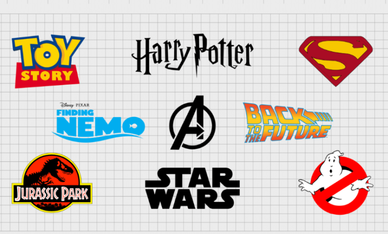
Using iconic or thoughtfully crafted fonts, filmmakers and designers can turn titles, posters, and trailers into visual experiences that resonate long before the movie begins. Here are types of movie fonts:
Display and Decorative Fonts
Display fonts are bold and attention-grabbing, making them ideal for titles and key promotional materials. Decorative fonts with unique letterforms can reflect the film’s mood or theme. For example, a fantasy movie might use ornate, whimsical fonts, while a crime thriller could use sharp, geometric lettering.
See also: How IT Companies Help Businesses Scale with Technology
Handwritten and Script Fonts
Handwritten fonts convey a personal, intimate feel, making them suitable for romantic or dramatic films. Script fonts with flowing lines can evoke elegance and sophistication, often used for period dramas or romantic narratives.
Serif and Sans-Serif Fonts
While less decorative, serif and sans-serif fonts provide clarity and professionalism. Serif fonts can add a classic or historical feel, while sans-serif fonts convey modernity and minimalism. They are often used in supporting text, taglines, or subtitles to maintain readability.
Best Practices for Using Movie Fonts
Ensure Readability
No matter how creative a font is, it must remain legible at various sizes and distances. Titles on posters, trailers, and merchandise should be easy to read at a glance, especially in crowded visual environments.
Pair Fonts Thoughtfully
Movie designs often use multiple fonts for hierarchy. Pair a bold display font for the main title with a simple sans-serif or serif font for subtitles, taglines, or credits. This balance ensures visual appeal without sacrificing clarity.
Match Fonts to Visual Elements
Fonts should complement other design elements, such as color schemes, imagery, and composition. A horror movie with dark, textured visuals benefits from fonts with sharp edges or distressed effects, while a romantic film may pair soft colors with flowing script fonts.
Create Emotional Impact
The ultimate goal of a movie font is to evoke emotion. Experiment with weight, spacing, and style to reinforce the story’s tone. The font should resonate with the audience on an emotional level, making the film more memorable and engaging.
Conclusion
Movie fonts are more than just typography—they are a storytelling tool that conveys mood, genre, and identity. By carefully selecting fonts that align with a film’s theme and pairing them thoughtfully with visual elements, designers can create compelling, memorable designs that captivate audiences. From display and decorative fonts to handwritten scripts and clean sans-serifs, the right movie font enhances both promotional materials and the overall cinematic experience. Proper use of movie fonts ensures that audiences feel the emotion, anticipate the story, and recognize the film instantly, making typography an indispensable part of movie design.